3. Bar charts and colors
In this lecture we demonstrate:
- another way to move cells around a Jupyter notebook;
- how to visualize data using bar charts; and
- how to use colors in charts.
3.1. A bit more about Jupyter notebooks
We have already on a few occasions said that each Jupyter notebook is a sequence of cells, and each cell can contain some text, an expression, or a Python program. Buttons at the top of the page make it possible for you to manipulate cells. We have already used the following buttons:
- Run which runs a cell,
- the dskette which saves the notebook,
- + which adds a new cell below the active cell, and
- up and down arrows which move the active cell.
The following three buttons:
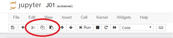
perform the usual actions cut (cut the cell from the notebook and memorize it, button that looks like scissors), copy (leave the cell in the notebook but memorize a copy of it, button that looks loke two sheets of paper) and paste (insert the memorized cell, button that looks like placing a sheet of paper onto a clipboard).
If you wish move a cell:
- click on the cell,
- click the cut button ("scissors") to remove the cell from the notebook and memorize it,
- click somewhere else in the Jupyter notebook, and finally
- click the paste button ("placing a sheet of paper onto a clipboard") to insert the memorized cell.
This operation is briefly called cut/paste.
If you wish make a copy of a cell:
- click on the cell,
- click the copy button ("two sheets of paper") to memorize the cell,
- click somewhere else in the Jupyter notebook, and finally
- click the paste button ("placing a sheet of paper onto a clipboard") to insert the memorized cell.
This operation is briefly called copy/paste.
3.2. Bar charts
Quite often it is more convenient to represent data by a sequence of bars instead of by a continuous line. Such charts are called bar charts (for obvious reasons).
Let us first import the library:
import matplotlib.pyplot as plt
After the import, the library is available in the notebook and there is no need to import it again. However, the import pertains to this notebook only.
Assume that a these are the marks of a student:
| Subject | Mark |
|---|---|
| Maths | 2 |
| English | 4 |
| Arts | 5 |
| History | 3 |
| PE | 5 |
| Music | 4 |
| Technology | 5 |
We'll represent the data in terms of two lists like this:
subjects = ["Maths", "Eng", "Arts", "Hist", "PE", "Music", "Tech"]
marks    = [2,        4,     5,      3,      5,    4,       5    ]
The function bar can be invoked to represent these data in the form of a bar chart:
plt.bar(subjects, marks)
plt.title("Marks of a student")
plt.show()
plt.close()

If you wish to resize the chart you can invoke the function figure with its parameter figuresize like this:
plt.figure(figsize=(10,5))
plt.bar(subjects, marks)
plt.title("Marks of a student")
plt.show()
plt.close()

The pyplot library assigns colors to charts the way it finds appropriate. If we wish to change the color of a chart we can simply request another color by throwing in the color parameter as follows:
plt.figure(figsize=(10,5))
plt.bar(subjects, marks, color="g")
plt.title("Marks of a student")
plt.show()
plt.close()

The chart is now green ("g" = green). We have the following colors at our disposal:
| Letter | Color |
|---|---|
| "b" | blue |
| "g" | green |
| "r" | red |
| "c" | cyan |
| "m" | magenta |
| "y" | yellow |
| "k" | black |
| "w" | white |
3.3. Displaying two sets of data on the same chart
"Normal body temperature" is actually an interval of temperatures that changes with the age og the person. When measured in the armpit the interval of temperatures that is considered normal for an age is given the this table:
| Age | Temperature ($^\circ$C) |
|---|---|
| 0--2 years | 34.7--37.3 |
| 3--10 years | 35.9--36.7 |
| 11--65 years | 35.2--36.9 |
| preko 65 years | 35.6--36.2 |
The data can be represented as three lists:
age        = ["0-2", "3-10", "11-65", "65+"]
normalT_lo = [34.7,  35.9,   35.2,    35.6]
normalT_hi = [37.3,  36.7,   36.9,    36.2]
We shall visualize this situation on the same chart by invoking bar twice:
plt.bar(age, normalT_hi)
plt.bar(age, normalT_lo)
plt.title("Normal body temperature by age")
plt.xlabel("Age (years)")
plt.ylabel("Temperature (C)")
plt.show()
plt.close()

Functions xlabel and ylabel add additional explanations to the $x$- and $y$-axis.
Unfortunately, this chart is not very informative because the intervals we are trying to depict are relatively small. Since we would like to focus on intervals of temperatures we can limit the range ov values that are represented by the $y$-axis. In this case, using the ylim ($y$-limits) function we are going to limit the range of the temperatures displayed to the interval $34-39^\circ C$.
plt.ylim(34,39)
plt.bar(age, normalT_hi)
plt.bar(age, normalT_lo)
plt.title("Normal body temperature by age")
plt.xlabel("Age (years)")
plt.ylabel("Temperature (C)")
plt.show()
plt.close()

Note also that the order of the two bar functions matters! The library draws bars representing data in the order in which they appear in the Python code. Since the values in the normalT_hi are greater that the values in normalT_lo the other possible ordering of the bar commands produces the chart in which the higher values are painted over the lower ones, which is not what we had in mind:
plt.ylim(34,39)
plt.bar(age, normalT_lo)
plt.bar(age, normalT_hi)
plt.title("Normal body temperature by age")
plt.xlabel("Age (years)")
plt.ylabel("Temperature (C)")
plt.show()
plt.close()

Therefore, we draw higher values first, and then paint the lover values over them:
plt.ylim(34,39)
plt.bar(age, normalT_hi)
plt.bar(age, normalT_lo)
plt.title("Normal body temperature by age")
plt.xlabel("Age (years)")
plt.ylabel("Temperature (C)")
plt.show()
plt.close()
For those who did not spend all this time to produce the diagram it may be unclear which values are represented by which color. This is why it is possible to add a legend to the chart. To do so, each bar command gets and extra parameter of the form label="explanation" which provides a short explaination of what data are presented by the diagram. The function legend at the end puts a legend in one of the corners of the chart:
plt.ylim(34,39)
plt.bar(age, normalT_hi, label="upper limit")
plt.bar(age, normalT_lo, label="lower limit")
plt.title("Normal body temperature by age")
plt.xlabel("Age (years)")
plt.ylabel("Temperature (C)")
plt.legend()
plt.show()
plt.close()

3.4. Exercises
Exercise 1. Look at the code carefully and then answer the questions:
import matplotlib.pyplot as plt
plt.ylim(34,39)
plt.bar(age, normalT_hi, label="upper limit")
plt.bar(age, normalT_lo, label="lower limit")
plt.title("Normal body temperature by age")
plt.xlabel("Age (years)")
plt.ylabel("Temperature (C)")
plt.legend()
plt.show()
plt.close()
- What does the function
bardo? - What happens if we swap the two lines of code containing the
barfunctions? - What does the function
xlabeldo? - What do the functions
ylimandlegenddo? - How would you change the size of this chart?
- How would you change the color of bars to green and yellow?
Exercise 2. The first ten places on the ATP list on July 21st, 2109 look like this:
tennis_players = ["Đoković", "Nadal", "Federer", "Thiem", "Zverev", "Tsipras", "Nishikori", "Khachanov", "Fognini", "Medvedev"]
ATP_points     = [12415,      7945,    7460,      4595,   4325,     4045,       4040,        2890,        2785,      2625]
Visualize this by a bar chart.
Exercise 3. The biologists have up to now classified more than 2,000,000 species of living beings. They are all divided into five kingdoms and the approximate number of species per kingdom is given in this table:
| Kingdom | Number of species |
|---|---|
| Animalia | 1,400,000 |
| Plantae | 290,000 |
| Fungi | 100,000 |
| Protoctista | 200,000 |
| Prokaryotae | 10,000 |
Visualize this data by a bar chart.
Exercise 4. The following table summarizes the highest and the lowest recorded temperatures (in $^\circ$C) on each of the continents:
| Continent: | Europe | Asia | Africa | North America | South America | Australia | Antarctica |
|---|---|---|---|---|---|---|---|
| Highest recorded temp: | 48 | 54 | 55 | 56.7 | 48.9 | 50.7 | 19.8 |
| Lowest recorded temp: | -58.1 | -67.8 | -23.9 | -63 | -32.8 | -23 | -89.2 |
Visualize the data on the same chart. Use red bars to display highest recorded temperatures, and blue bars for the lowest ones.
Exercise 5.
(a) Search the Internetu to find out what does the function barh from the library matplotlib do.
(b) Solve Exercise 4 using the barh function.
Exercise 6*. It is estimated that on July 1st, 2019 the population of China was 1,420,062,022 and the population of India was 1,368,737,513. It is also estimated that the population of China increases by 0.35% per year, while the population of India increases by 1.08% per year.
(a) Assuming that the rate of increase of the population of both countries is not going to change in near future visualize the population of China and India in the following ten years on the same chart using the plot function.
(b) Read from the chart in which year is India going to overtake China as the most populated country on the Earth.
